Case Study: UI/UX B2B ecommerce

What is Yarsa Bazar?
Yarsa Bazar is an online marketplace that connects buyers with vendors offering raw materials, services, manufactured goods, and bulk products. Similar to platforms like IndiaMART. Yarsa Bazar allows users to find vendors for a wide range of needs, making it easier to source products and services from various suppliers in one place.

Why This Case Study?
This case study explores the unique challenges of designing an e-commerce platform like Yarsa Bazar, where the focus is on listing vendors and their prices for bulk units, rather than the typical direct-to-consumer sales model. It delves into the design process, highlighting the strategies used to create a user-friendly interface that meets the needs of both buyers and vendors in this specialized marketplace.
Overview
Yarsa Bazar aims to streamline the process of sourcing bulk products and services by providing a platform where buyers can easily compare vendors and their offerings. Unlike traditional e-commerce websites, Yarsa Bazar focuses on connecting buyers with vendors who offer bulk pricing, making it essential to design an interface that supports this business model while remaining intuitive and accessible.
The Course of Action
- Understanding the Unique Business Model
- Research Analysis ( Site map, Affinity map & Persona)
- Pen-paper wireframing & High fidelity Prototyping
- User Testing
Problem
Designing a Vendor Page: Yarsa Bazar’s vendor page needs to clearly display complex details like TaxID, Registration type, EXIM code, and number of branches. The challenge is designing a UI that organizes this information clearly and accessibly.
Designing a Product Page: Unlike traditional e-commerce sites, Yarsa Bazar’s product page needs to present detailed product information and multiple vendor prices for bulk orders. The challenge is to design a UI that allows users to easily view, compare, and select the best prices while keeping the layout clean and user-friendly.
Mobile-Friendly, App-Like Design: The goal was to develop a mobile web version of Yarsa Bazar that mimics the intuitive experience of a native app, addressing the limitations of standard responsive designs, while avoiding a dedicated app due to users’ device storage constraints.
Research Process
Primary Research
Given the project’s fast-paced nature, we conducted primary research by interviewing stakeholders and existing users of similar platforms like IndiaMART. This helped us understand the key pain points and expectations of users who rely on vendor listings for bulk purchases.

Secondary Research
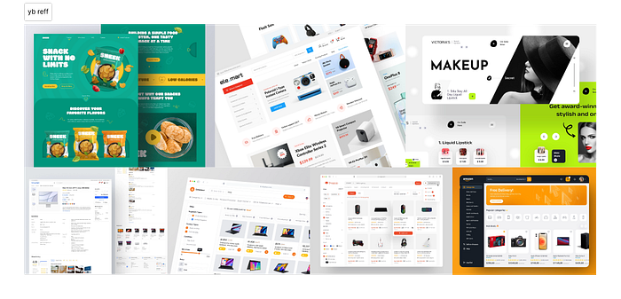
We also analyzed existing e-commerce platforms, focusing on how they handle vendor listings and bulk pricing. This research provided valuable insights into best practices and potential pitfalls, which informed our design decisions.

User Persona
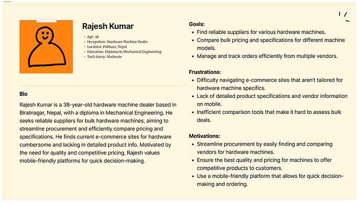
To ensure the design met user needs, I created a user persona based on interviews with my cousins who are involved in wholesale and bulk purchasing. This persona helped guide the design process, ensuring the platform was tailored to the specific needs of bulk buyers.


Affinity Mapping
Using the insights gathered from research, we created an affinity map to organize and prioritize user needs and pain points. This process helped us identify key areas of focus for the design, such as simplifying vendor comparisons and streamlining the purchasing process.

Siteflow and Wireframe
The siteflow was designed to streamline the user journey from the homepage to vendor listings and purchasing processes, ensuring easy navigation and clear comparisons of vendor offerings. While wireframes were developed for key screens like the homepage, vendor listings, and bulk order pages, these went through numerous variations and iterations based on UX principles and team feedback. Due to these continuous refinements, the wireframes cannot be shown.

Solution
Designing a Vendor Page: To present extensive vendor information like TaxID, EXIM code, and contact details, I used the Law of Similarity to group related details into distinct sections for easier recognition. The Law of Proximity placed related elements, such as contact buttons, near relevant information for efficient access. The Law of Connectedness applied visual connections to clearly delineate and relate different pieces of information, enhancing clarity and organization.

Designing a Product Page: To design a product page for Yarsa Bazar that effectively displays detailed product information and various vendor prices, I used Hick’s Law to limit the number of visible options at once, simplifying decision-making and reducing user overwhelm. Jakob’s Law was applied to align with familiar e-commerce patterns, making the interface intuitive and easy for users to navigate, thereby improving their ability to compare prices and select the best option efficiently.

Mobile-First Design Approach: To address the challenge, I created a responsive mobile web version of Yarsa Bazar that mimics a native app experience, featuring a navigation bar and effective search filters. This approach ensures users can access the site easily from their browser without needing to install a dedicated app.

Conclusion
The UI/UX design for Yarsa Bazar successfully addressed the unique challenges of a vendor-focused e-commerce platform. By combining thorough research, user-centered design principles, and iterative testing, we created a polished and intuitive interface that meets the needs of both buyers and vendors. This project not only expanded my understanding of e-commerce design but also reinforced the importance of tailoring design solutions to specific business models and user needs.